digital meeting service
Memlin

The brief
don't miss a thing
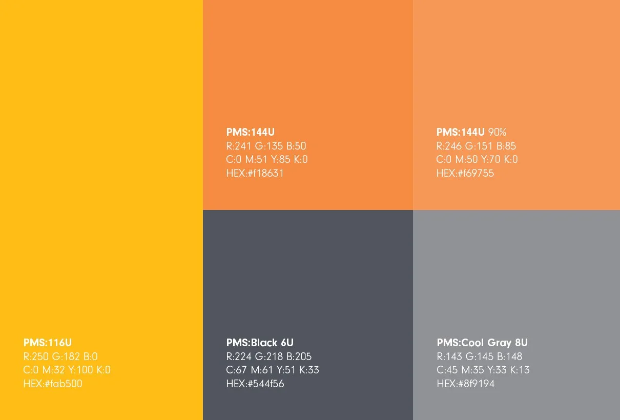
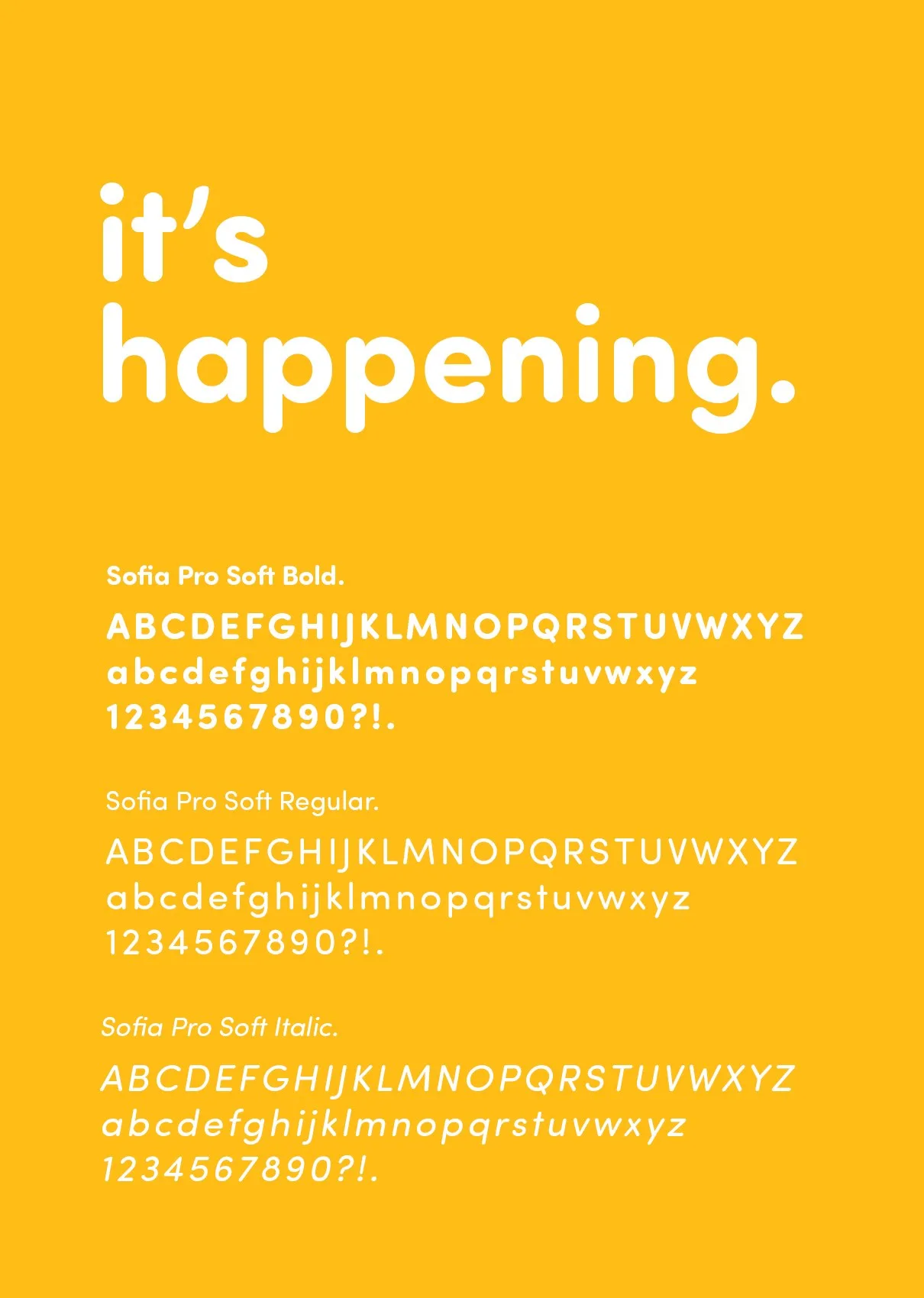
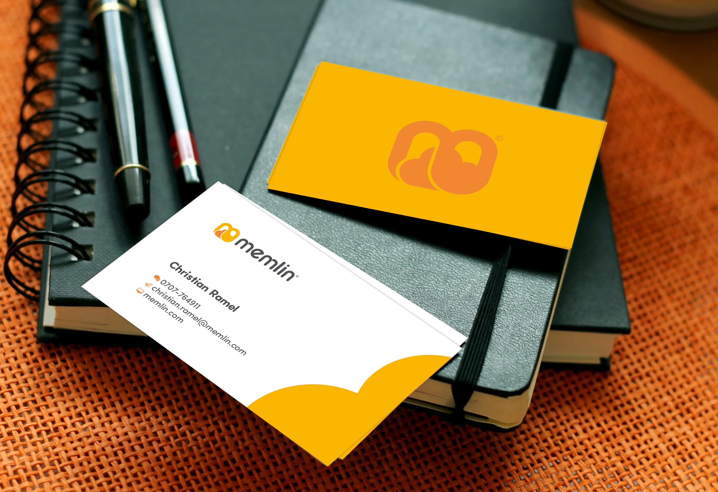
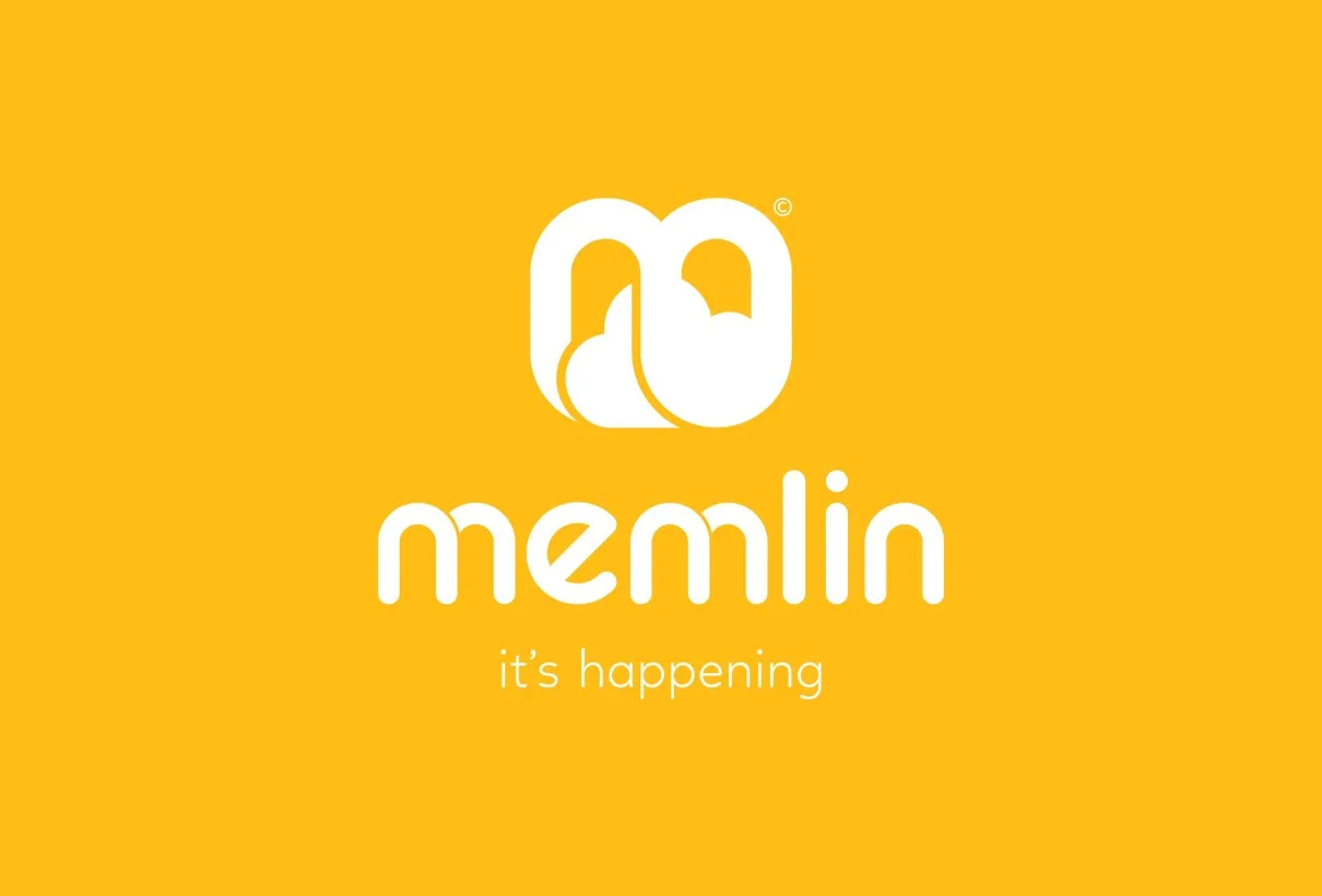
Memlin is a digital service that makes it easier to manage meetings and events. We created a highly recognisable visual identity and logo that show the company’s digital focus. The identity is modern, and the logo combines an m, a cloud and a link, which stand for Memlin and its cloud-based service that connects people. A typeface with rounded edges feels youthful but professional. The orange and grey work well digitally and in print.
- formal – playful: 2 of 4, closest to formal
- low price – high price: 3 of 4, closest to high price
- analogue – digital: 4 of 4, closest to digital
- everyday – extravagant: 2 of 4, closest to everyday
- traditional – trendy: 3 of 4, closest to trendy
- simple – complex: 1 of 4, closest to simple
- cautious – cutting-edge: 3 of 4, closest to cutting-edge
- rational – emotional: 2 of 4, closest to rational





Got a project in mind?
Tell us what you want to achieve and we’ll talk about how we can help.